
Relara
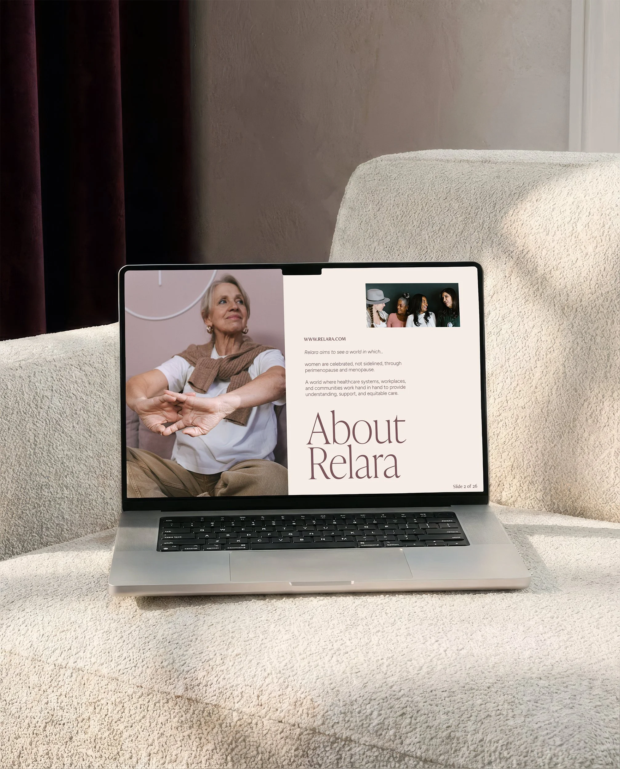
Relara was founded on the belief that women's wellbeing is deeply interconnected. Hormones, stress, nutrition, sleep, movement, and emotional health don't exist in isolation—they shape how women experience their careers, relationships, confidence, and everyday lives. Combining a background in human resources with a passion for women's health, my client Christina, through Relara, equips career-driven women navigating perimenopause with the education, support, and community they need to thrive, while also partnering with organizations to create healthier workplaces through menopause-inclusive policies, programs, and training.
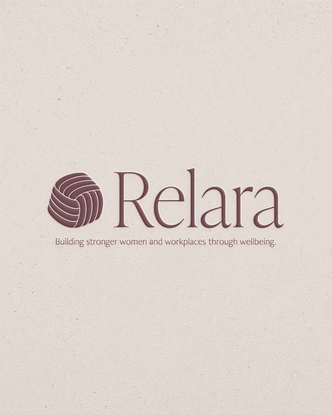
The visual identity reflects this holistic approach. A custom interwoven symbol represents the many aspects of wellbeing that are inseparably connected, illustrating how each choice—from rest and nutrition to stress management and hormonal health—ripples into every area of life. The logo's continuous form also evokes connection, growth, and support, reinforcing Relara's commitment to helping women navigate seasons of change with confidence rather than confusion.
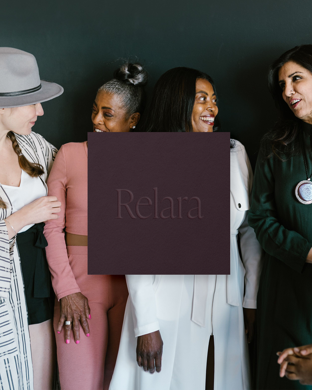
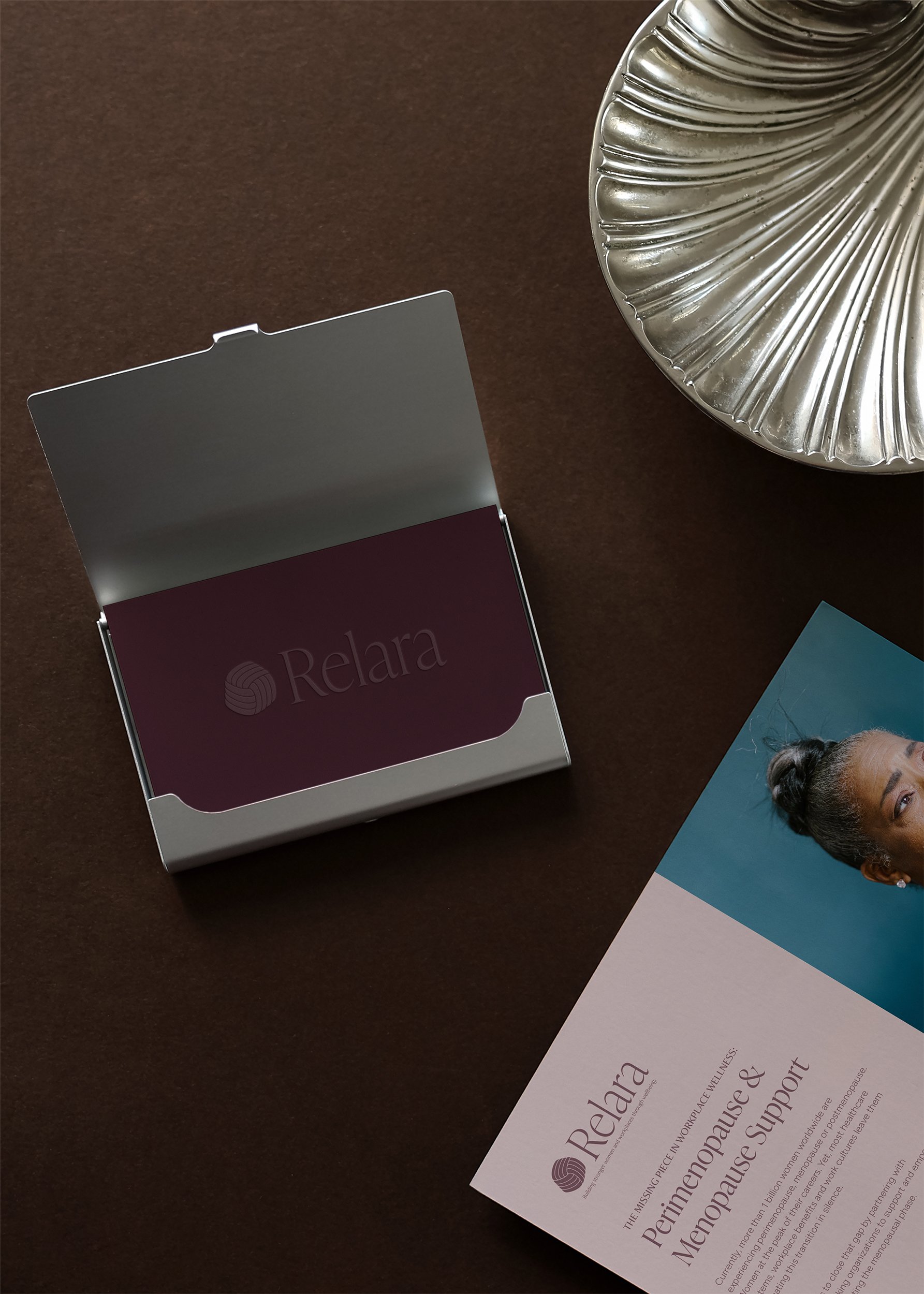
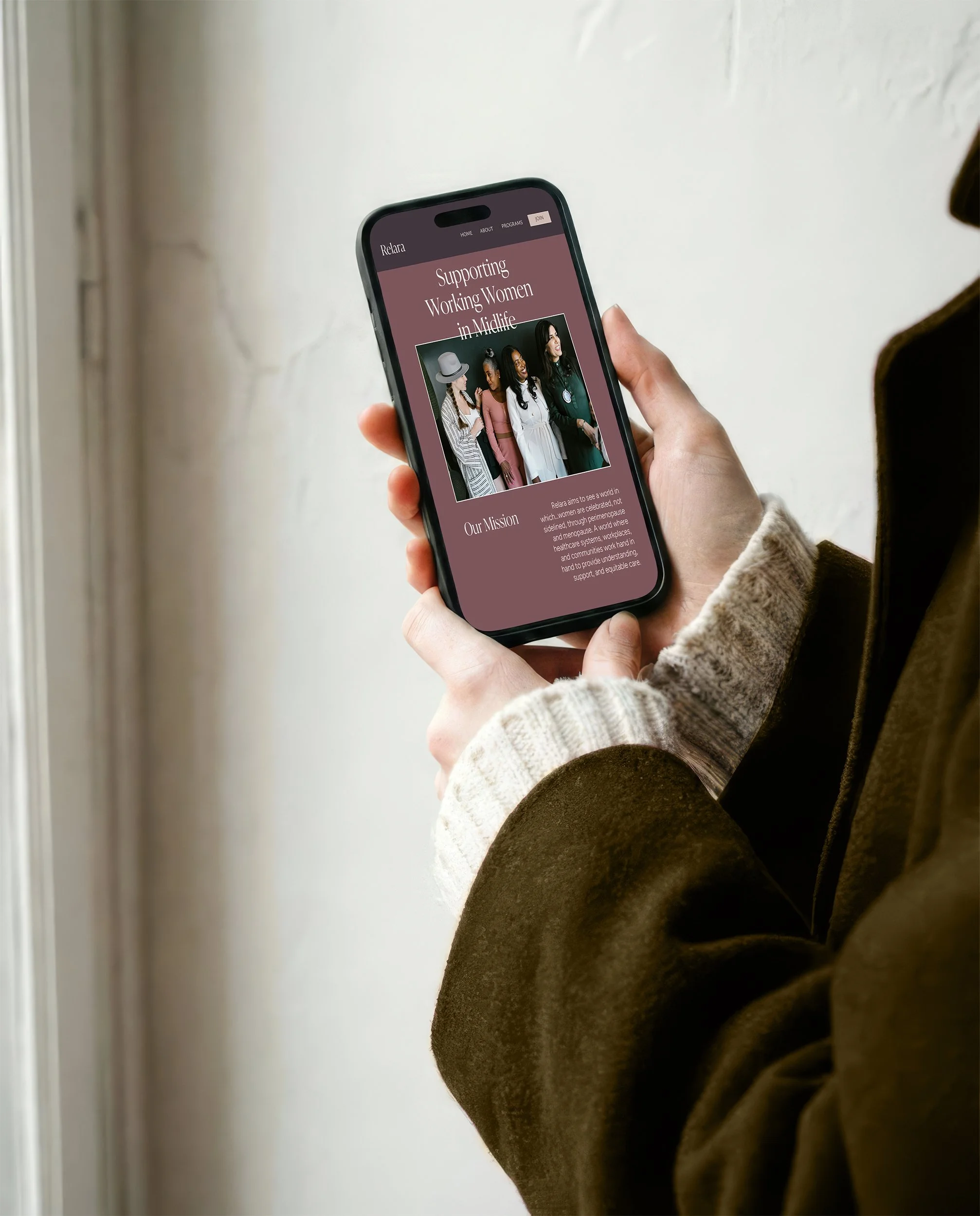
Editorial-inspired typography introduces credibility and professionalism suited for corporate audiences. A palette of muted mauves, a rich plum tone, a warm and woodsy green, a soft and pale pink, and refined neutrals balances strength with femininity, creating a calming visual experience that reflects Christina's steady, reassuring presence. Rather than relying on expected floral imagery, the brand communicates femininity through sophisticated color, thoughtful typography, and intentional simplicity.


“Not only did you nail what I hoped for, you were extremely easy to work with, handled feedback well, helped guide me in the right direction, and I loved that our faith was a central part of our conversations. I also appreciate that you took time to educate me on areas I wasn't familiar with, so I'd be comfortable making decisions and using my brand going forward.”
CHRISTINA TYMONY