
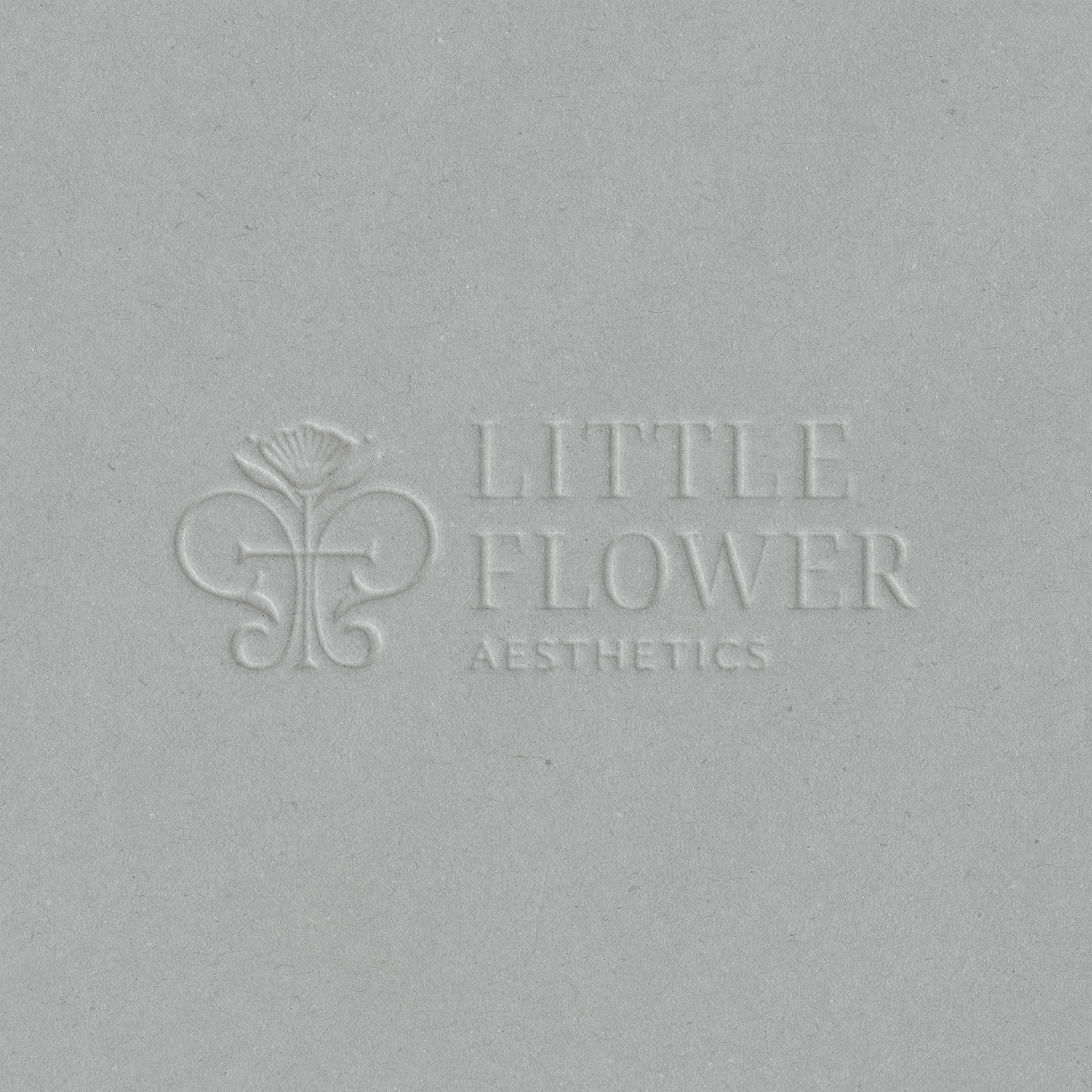
Little Flower Aesthetics
Little Flower Aesthetics was founded on the belief that aesthetics can be an extension of compassionate and dignified care, helping women feel confident while honoring their inherent God-given beauty. Anne Keller wanted a brand that reflected that philosophy with elegance, depth, and authenticity.
After realizing that an AI-generated brand couldn't capture the heart behind her practice, Anne partnered with Verve & Concord to create an identity that felt both timeless and deeply meaningful.
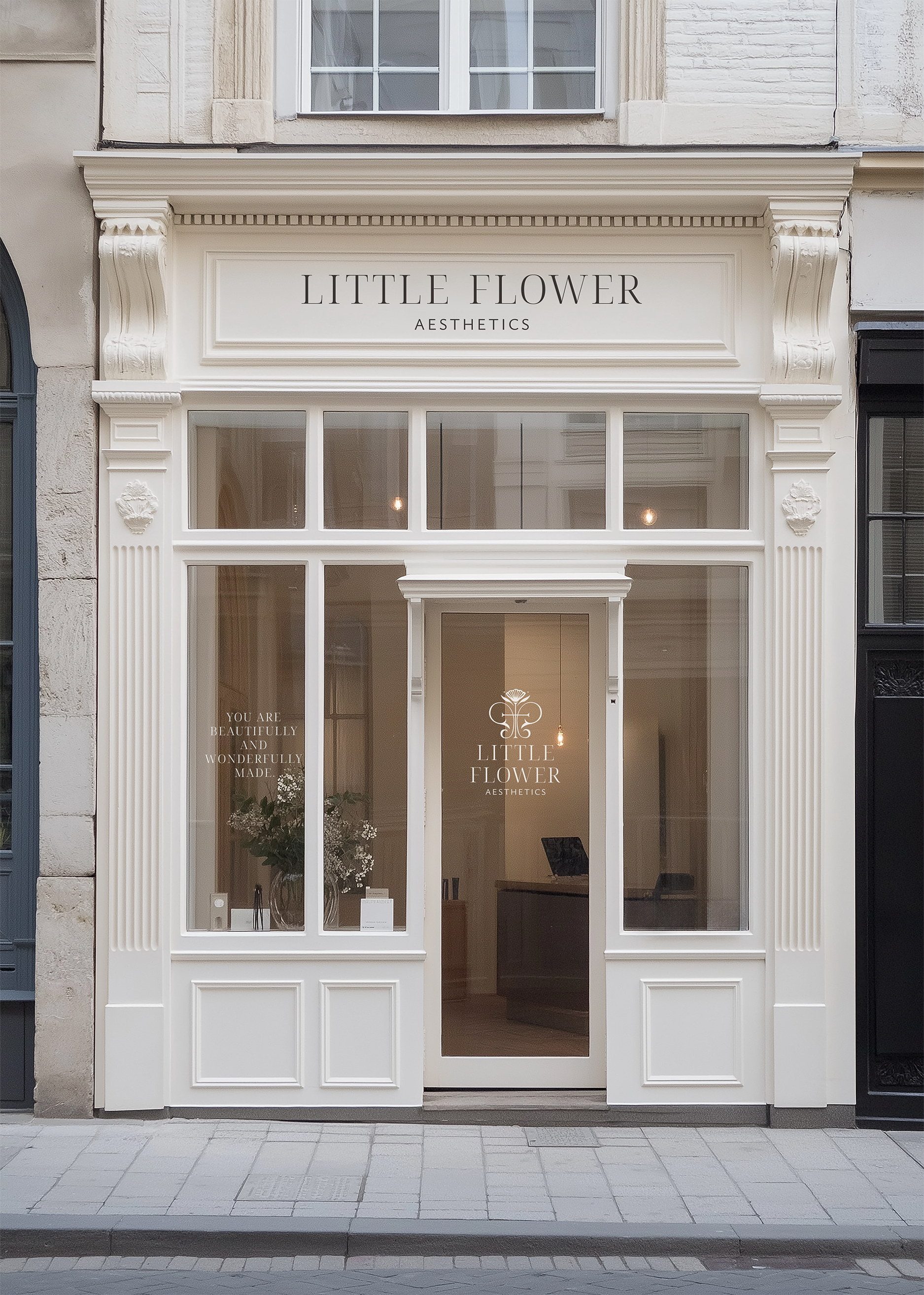
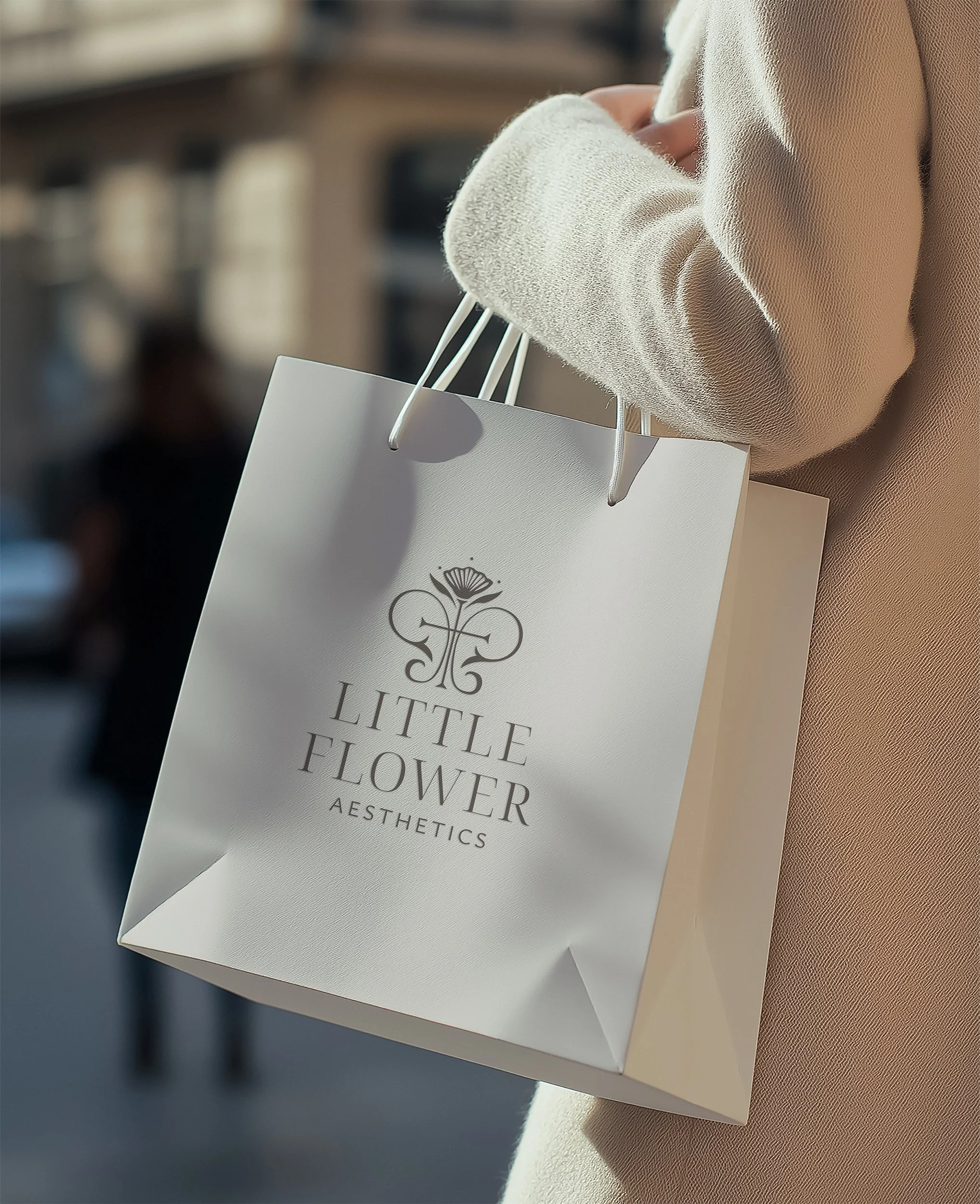
Together, we developed a visual direction inspired by softness, femininity, and subtle Marian symbolism. A refined color palette and editorial typography create an elevated, welcoming aesthetic. A custom logo thoughtfully weaves together a fleur-de-lis, a flower, a cross, and a reference to the Holy Trinity, symbolizing both the studio's namesake and the faith that quietly informs its mission.
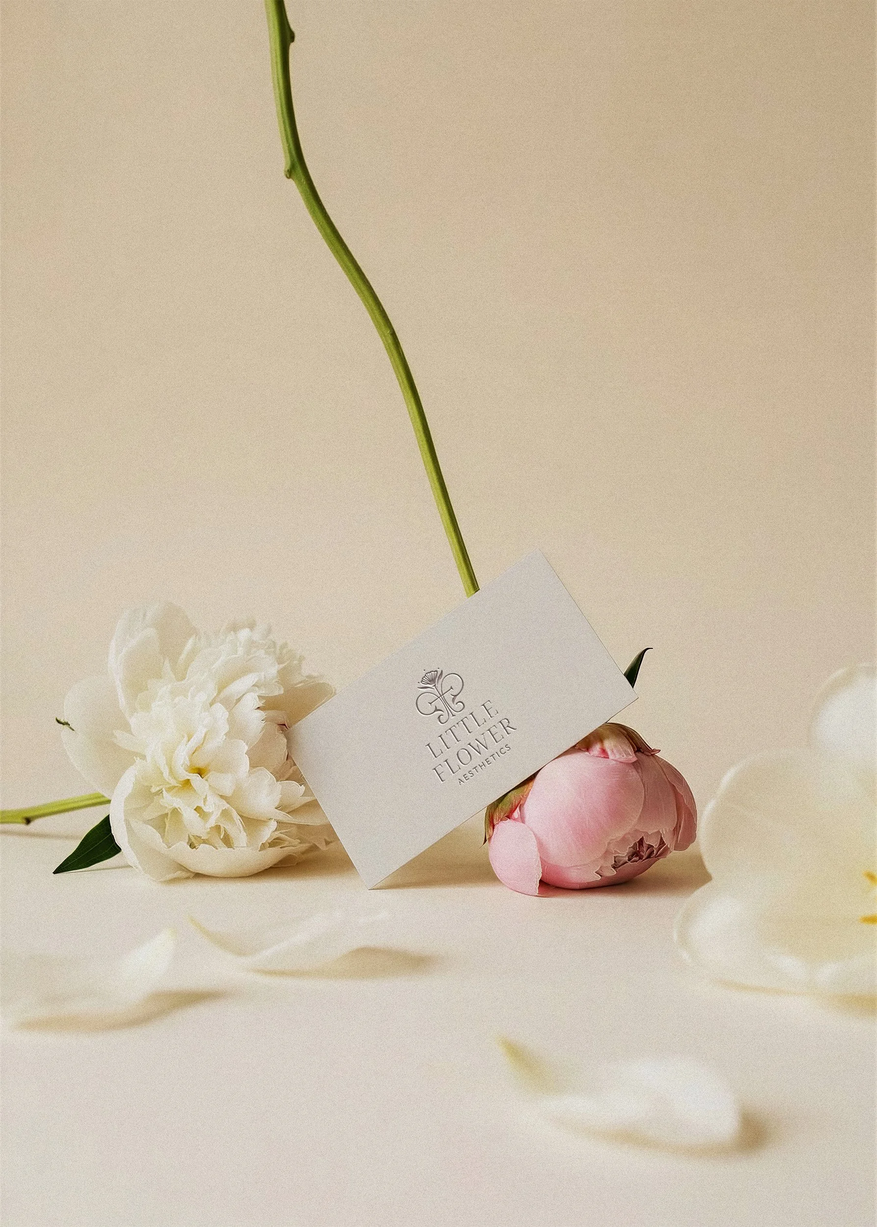
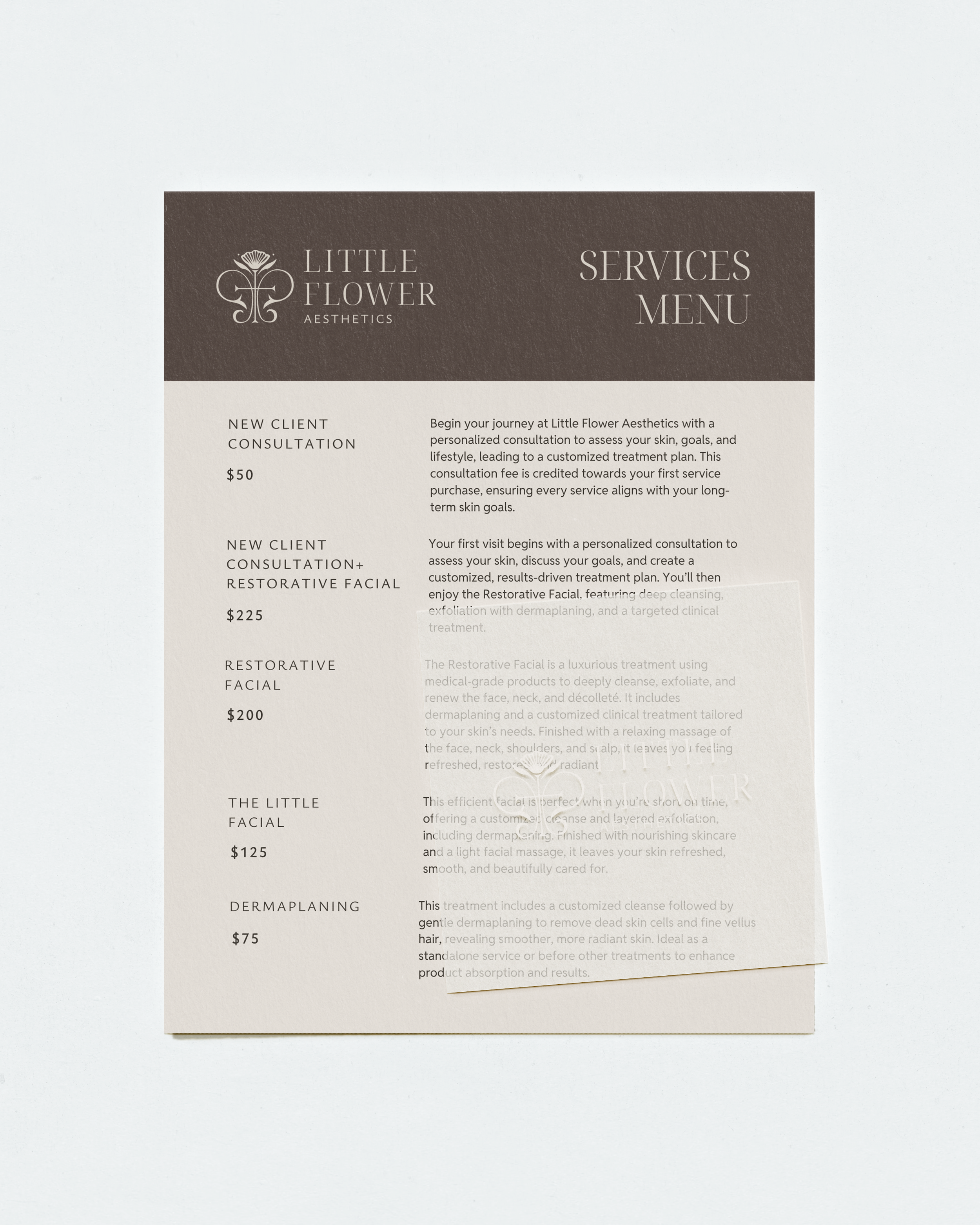
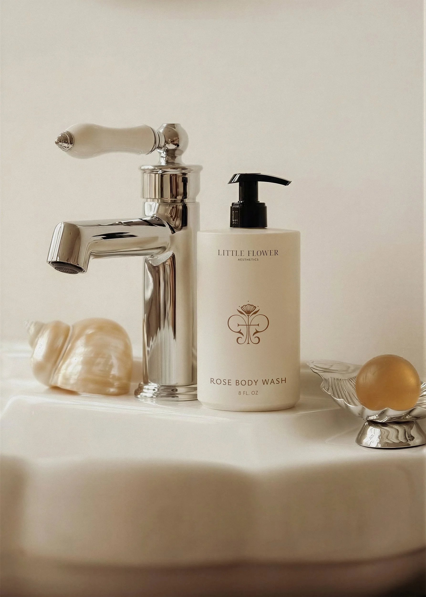
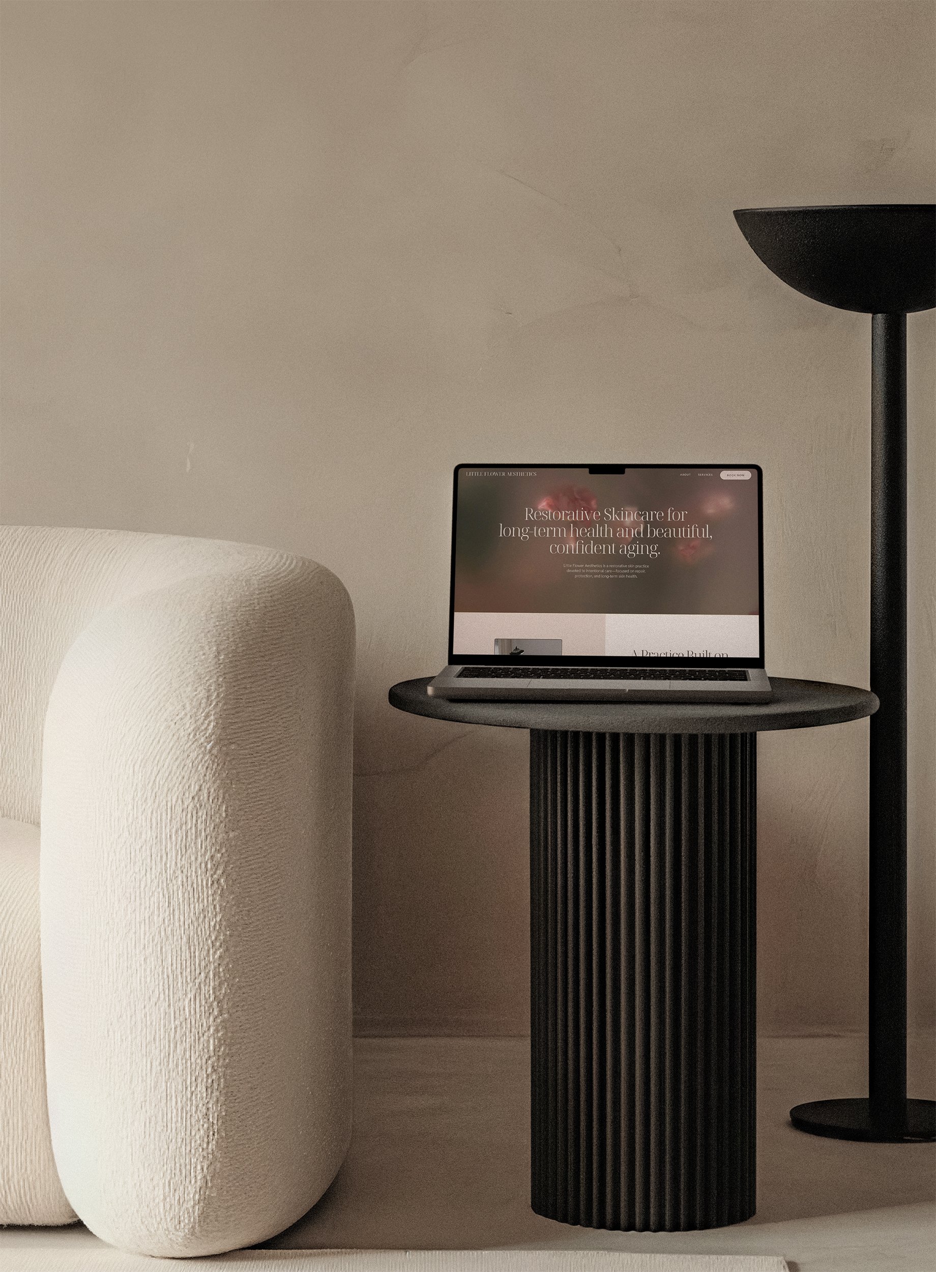
That strategy became the foundation for every client touchpoint. From a custom website to business cards, treatment menus, and marketing materials, each piece was intentionally designed to create a cohesive brand experience that feels peaceful, prayerful, and unmistakably Little Flower Aesthetics.
The result is a brand that not only reflects Anne's expertise but also communicates the care, dignity, and intentionality clients experience from the moment they discover the practice.
“Results are beyond my initial vision of the logo and branding. Again, so much depth was put into it all and I was finally feeling seen and heard about how important my brand meant to me.”
ANNE KELLER